[vc_row css_animation=”” row_type=”row” use_row_as_full_screen_section=”no” type=”full_width” angled_section=”no” text_align=”left” background_image_as_pattern=”without_pattern”][vc_column][vc_column_text]
This is not your typical interior design story, in which a commission usually originates from a longstanding collaboration between client and designer, or else a referral from a trusted homeowner known to both parties. In the case of a Palm Beach mansion exceeding 10,000 square feet, disparate teams were convened to achieve the clients’ vision—a stately, traditional family retreat that could easily accommodate a multigenerational family.
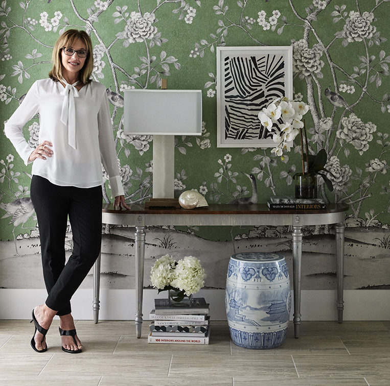
It was the clients who brought in the renowned Palm Beach architect Patrick Segraves, while the builder, Edgewater Custom Homes of Tequesta, enlisted Jackie Armour, principal of Jupiter-based JMA Design. “It was very much a team collaboration,” Armour says. “We were involved early on and the clients stated what they wanted from the onset, so we all worked together to realize it.”
Armour is unrestrained about her admiration for Segraves’ contribution—and his willingness to let her take the baton when the time came. With roots in British Colonial, “the house is magnificent,” she enthuses, “with wonderful proportions,” a show-stopping façade and a resort’s sense of arrival. In the back, the steep yard was terraced, with wide steps leading down to the pool and guesthouse, features that convey a touch of old-world grandeur.
But as Armour tells is, Segraves’ confident execution was matched by his generosity. “We were able to do all the interior architecture,” Armour recalls. “Pat was great about turning the plans over to us and allowing us to detail the interiors.” What followed was an assertive study in depth, characterized by sculpted ceilings and detailed wall treatments, as evidenced right away in the handsome two-story paneled foyer. “I love paneled walls,” the designer says. “It’s always a little bit of a challenge when we have it rise up a staircase, because many times there isn’t a good termination point going up to the second floor. But Pat is such a good architect that the way he set this up for us was kind of seamless.” A Phillip Jeffries silk wallcovering in pale blue takes over above the chair rail.
In terms of flow, one might expect a Colonial-inflected home would lead to discrete rooms rather than the open plan that today’s homeowners typically demand. But the way we live now took precedence over stylistic doctrine. “We definitely kept this home much more Florida-style open,” Armour says, enumerating the ways in which this was accomplished. “The two-story foyer is nice and large, and there’s an ample opening to the dining room—almost no wall, so if you’re in the living room you can see the dining room and vice versa. The living room is a straight line from the foyer, very open, with three sets of French doors that lead to the lanai and pool. The kitchen breakfast area and family room are likewise all open.”
[/vc_column_text][vc_empty_space][blockquote text=”Blue is my go-to. I have blue and green in my own home.” show_quote_icon=”yes”][vc_empty_space][vc_column_text]
A home that’s so free flowing would all but require a color palette that proves seamless as one moves through the space; in this case, soft blues, whites and creams take the reins. “The owners were coming from a Mediterranean home,” Armour explains, “and the color palette was a lot darker, deeper and more saturated, and they knew they didn’t want this home to look like that.” (Armour went on to rehabilitate and then integrate several of the heavy Mediterranean-style pieces through reupholstery.) Another client request: soft, tactile fabrics. Beyond those loose parameters, the homeowners entrusted Armour with most decisions, and she implemented considerable variety within the tight color scheme.
Which brings us to the ubiquitous blue. “Blue is my go-to,” the designer says. “A lot of our clients love blue, and I have blue and green in my home—it’s very soothing. It’s also a very versatile color. I feel there isn’t much that doesn’t look good with it. Once I did a living room with 14 different shades of blue in it, with different fabrics, and you really can’t get it wrong.” In this home, the living room is anchored by a blue sofa from Pierson, a brand known for its comfort; it is accompanied by lamps with pleated, custom-made blue shades and a plush ottoman, reupholstered in teal. As far as Armour’s interior architecture, the tray ceiling and inset bookcases lend the room a cozy jewel box-like quality.
In the kitchen, which is mostly white and transitional, the countertops gleam with quartzite, while the lantern-like pendants suspended above refer to the home’s colonial style. Sea colors liven things up: Thassos Greek marble tiles are trimmed in Ming green marble, and powder blue barstools, wrapped in a performance fabric, inject a casual note. Palm fronds from the home’s grounds rise from a pale blue vase.
Perhaps the room perhaps most committed to the hue is the dining room, which boasts a sky-blue ceiling, host chairs enveloped in a rather ornate traditional textile, and side chairs covered in a soft Cowtan & Tout chenille. “The majority of the fabrics we used on this project were from Cowtan & Tout,” “It’s just a good, traditional fabric line.”
“I can be a ‘more-is-more’ designer,” she concedes, citing the dining room’s disparate patterns on the host chairs (from Peter Fassano Fabrics), walls (also Fassano) and Cowtan & Tout draperies. Yet each print was curated with great care to represent a distinct level of scale; a delicate pattern—for example, on the walls—doesn’t compete with the more forthright design on the windows.
If the blue palette provides serenity, it finds an easy harmony with this companion sensibility—a logic of layers and textures—defined by subtle stimulation. The designer’s deft use of pattern warms up cool colors; this cool-warm relationship occurs throughout the home, in every sitting area and bedroom. For example, the master bedroom (blue and white, continuing the theme) contains fabrics on a continuum of scale: while the floral window treatments are vivid as seen from across the room, a comfy oval ottoman and a pair of armchairs are covered in patterns so subtle that one can only discern them from up close. The effect is immediately homey and safe: “The owners told me that it’s their favorite bedroom in any house they’ve lived in,” Armour says.
The commitment to versatility, as played out on a soothing blue and white canvas, makes it all work—that, and Armour’s unerring taste. It’s a delicate balance, to be sure, but one that is expertly and seemingly effortlessly achieved.
Photos by Brantley Photography
[/vc_column_text][vc_empty_space][vc_empty_space][vc_gallery interval=”3″ images=”62184,62186,62189,62188,62190,62193,62194″ img_size=”full” direction_nav=”yes” control_nav=”yes” show_image_description=”yes”][/vc_column][/vc_row]


